
Product Overview
Citizens Bank recently launched their "Made Ready" Campaign and with that, a new career page. Because Citizens Bank hires thousands of people per year in a variety of different roles, their business goals align with ensuring a smooth experience from job search to job offer.
The Citizens Bank job portal is comprised of two separate websites: the Citizens Bank job site (left) and the Citizens Bank Taleo site (right).

Project Goals
Through a Bentley University corporate sponsored project, our team, Usability Solutions Group, was tasked with evaluating and testing the Citizens Bank career portal for usability and accessibility improvement opportunities.
We aimed to address the following research objectives provided by Citizens Bank:
Content Usefulness: Do candidates have enough information to apply to the role that is right for them?
Content Findability: Is the information where a candidate/user would expect it to be?
Usability: What are the friction points?
Impressions: Are we making candidates think too much and starting the wrong type of relationship?
Accessibility: Is the application process accessible to special populations?
My Role
As part of a group, I participated in project planning, survey design, individual and group heuristic evaluations, moderated usability testing, data analysis and providing usability improvement recommendations.
Beginning Steps
Usability Solutions Group set out first to understand the research goals of Citizens Bank and from these goals devised a research plan. Our group began with a survey designed to gain insights from recently hired Citizens Bank employees, conducted both individual and group heuristic evaluations, and developed scenarios and tasks for usability testing.
 Final results from heuristic evaluation graphed by severity and location of violation. |  View of Citizens Bank website from perspective of red-green colorblind user. |  Survey sent out via Qualtrics to gain insights from recent hires. |
|---|---|---|
 Moderator's Guide. Analyzed high priority tasks of the site, created testing material based on these tasks. |  Discovered a total of 42 heuristic violations on desktop interface alone. Over 80 violations found across all 5 evaluators on both mobile and desktop. |
Based on the analyses above, Usability Solutions Group supposed two hypotheses:
Hypothesis 1: users will perceive the Citizens Bank job website more usable than the Taleo website.
Hypothesis 2: users who interact with the Citizens Bank job portal on mobile will perceive the website as less usable than users who interact with the Citizens Bank job portal on desktop.
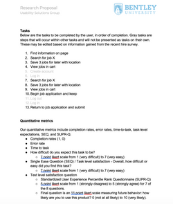
Usability Testing
Usability Solutions Group compiled ten tasks likely undertaken by a user of the career portal. Based on our heuristic evaluation, we created seven scenarios to test with participants.
The usability tests were performed as moderated remote tests and lasted for 1 hour. Participants were asked to think aloud as metrics such as error rate and SEQ answers were recorded. Four participants were tested on mobile, four tested on desktop. (Citizens Bank provided eight gift cards to compensate participants.)

User Insights
Usability Studies
Participants provided both positive and negative insights during their time interacting with the Citizens Bank career portal.
Data Analysis
Qualitative and quantitative data from each test was compiled and coded by the team. Each member coded participant feedback as positive, negative, or neutral and reviewed moderator notes to ensure accuracy of recorded SEQ, completion rates and error rates. Usability issues were named for consistency and given a criticality rating via severity and frequency.
 Moderator notesParticipant feedback coded positive, negative or neutral. |  Quantitative dataSEQ, completion rate, error rate, and supportive participant feedback |  Criticality TableIssues organized by error count and given criticality score based on severity and frequency. |
|---|
Results
Quantitative Results
After analysis of the qualitative data by my teammate, it was found that our hypotheses were rejected. Participants did not rate their experience of one site significantly higher than the other, nor did they rate one interface (mobile vs desktop) significantly higher than the other.
 SEQ by Website.png |  SEQ by Interface.png |
|---|
Qualitative Results
While our quantitative data did not provide statistically significant differences, our qualitative data showed clear differences in experience between the sites. Our team felt the numbers did not tell the whole story, both because of the sample size as well as the success rate of the tasks.
 Coded qualitative perceptions.png |  Coded perception by task.png |
|---|
Recommendations
I took the lead on developing recommendations for the 20 usability issues discovered during our study. Our team presented a table of the issues and recommendations organized by criticality and stating where the issue occurred (mobile, desktop or both).

Research Objective Analysis
Our group found areas of improvement in each of Citizens Bank's research objectives.
Content Usefulness
Participants felt the site contained wordy paragraphs of information they would not read and found the massive header photos to be distracting.
Content Findability
The lack of integration between the two sites caused frustration for almost all participants. Low error visibility and notification created friction points in tasks.
Usability and Accessibility
Our group found major usability opportunities on both sites that range across mobile and desktop interfaces.
We did not test specifically for accessibility, but did note the color scheme used may be difficult for certain colorblind populations.
Impressions
The calculated NPS (Net Promoter Score) from this test was significantly low in comparison to other banking and internet services. Participants used terms such as rigid, methodical, and lack of margin of error to describe their experience.
Next Steps
Our group provided Citizens Bank with the above information in both presentation and report format, including further actions available to continue site improvement.
Test Recommendations
Mockup and test the provided recommendations of most critical usability issues identified.
Implement Changes
Implement recommendations which surpass existing usability benchmarks in prototype testing.
Further Usability Testing
Conduct additional usability testing with a larger sample size via within study design to potentially achieve statistical significance with hypothesis testing.
Additional Qualitative Data
Utilize a more quantitative test design to set and compare time-to-task benchmarks on launched product.
Lessons Learned
Qualitative vs Quantitative
It it important to look at data as a whole, but also remember not to allow certain outcomes to affect your objectivity. "Numbers don't lie", but they also don't tell you the whole story.
Sample Size
I learned the importance of and making known the caveats of having a small sample size or sample of convenience. I also learned that just because a sample is small, doesn't mean you can't make important discoveries.
Testing Protocols
Building a usability study from the ground up is a lot of work and great care must be taken to ensure your test is the right test for what you are trying to get out of the study. Moderating is scary and fun! You never know what might happen.